Battle of the Chivalrous
OVERVIEW
As a UI/UXDesigner at Apex One studio, I worked on coming up with a quick layout design for their incubation team and iterating the UI based on the feedback for Battle of the Chivalrous, a mobile top-down medieval-themed battle royal. I worked with the team to help establish UX best practices and create an engaging experience where players could enjoy the game without any interruption.
TIMELINE
4-month
May 2022
ROLE
UI/UX Designer
User research, UX & UI Design, prototyping & user testing
HIGHLIGHT
During the design process, I observed a difference between the preferences of Asian and American players. By adapting my design approach and refining the user interface accordingly, I was able to create a UI that effectively meets the needs of the game's target player groups.

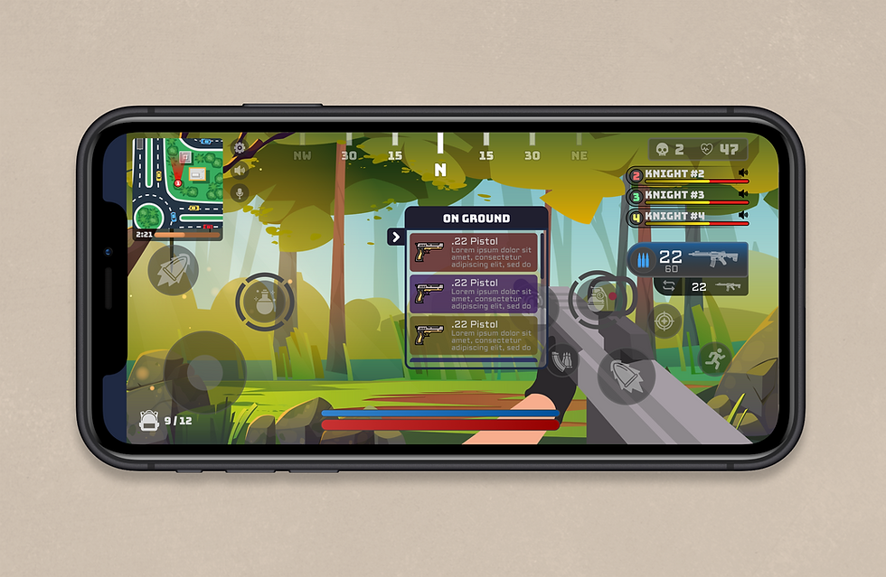
Final UI render showcasing the main lobby screen and the HUD
CLICKABLE LINKS
Quick link

Improving gameplay experience


Improving in match HUD


The Process
I worked under the studio’s design director and directly with the product owner, lead game designer, and team leads (game designers, artists, engineers, writers, and producers) to ensure that my ideas and design solutions improved the user experience and successfully met the business goals.

Gameplay experience
DEVELOPMENT PROCESS
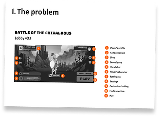
01. The Problem
-
The current FTUE (First Time User Experience) fails to motivate players to continue playing and lacks clarity in conveying the game's core loop and features.
-
The overall game experience is cluttered, complicated, and unintuitive.
-
The existing interactions for joining parties, customization, and mode selection are not innovative and are difficult to access.
-
The HUD (Heads Up Display) is constantly expanding, taking up an excessive amount of screen space.

HUD element I designed for the game before starting the redesign

User flow I created to visually explain how the user invite their friend
A quick look at the problem
The design showcased above was initially suitable for a US audience, as it presented a clean and uncluttered screen. However, for Asian players, the situation is different. Test results indicate that players became irritated when required to press several times to access certain functions. Additionally, feedback received highlights that some functions were hidden behind a button, which was inconvenient for players. Consequently, a redesign may be necessary to better cater to the preferences of the Asian player audience.
02. What I did
I collaborate with the studio's design director and work directly with the product owner, lead game designer, and team leads to establish UX best practices and develop features that would enhance player engagement. We conducted user testing, analyzed the resulting data, and worked closely with the customer service team to identify problems and implement necessary iterations to the game experience. Our goal was to make the game more relatable, accessible, and intuitive, while keeping the data-driven insights in mind.
Additionally, I conducted user research and competitive analysis on other games featuring a lobby and customizable characters to gain a better understanding of industry standards and identify areas for improvement.
Working closely with UI artists, we collaborated to create a dynamic and expandable game HUD that effectively conveyed all necessary information to the player. By leveraging a multidisciplinary approach, we were able to deliver a more compelling and user-friendly game experience.
Research insight
At the outset, I recognized the need to investigate the player's preferences regarding the display of information. As a result of my research, I was able to identify several reasons explaining their preferences:
-
Language: Many Asian languages, such as Chinese, Japanese, and Korean, use ideographic writing systems that require a large number of characters to convey meaning. This can make it difficult to display text in a way that is easy to read and understand, particularly on smaller screens. Consequently, many displays utilize icons, symbols, and graphics to convey information more efficiently.
-
Culture: Asian culture places great value on information, with individuals typically seeking as much information as possible before making decisions. This is a significant reason why so many UI elements are often displayed at the same time.
-
Phone choice: In many Asian countries, especially in East Asia, people tend to prefer larger Android phones over the smaller Apple devices commonly used in other regions. This preference for larger screens provides more available space to display detailed information, which further supports the clustered UI design approach.
Driving further...
Given the reasons I outlined above, I still need to get a bigger understanding of how other games in the same genre have managed to balance the need for detailed information with a clean, organized approach. To achieve this, I conducted further research, which allowed me to synthesize the following insights:
-
Other games in this genre have put a substantial effort into creating a visual hierarchy, given the large amount of detailed information displayed all at once. This is often achieved through the use of a higher than normal color contrast choice, a thick contrasting border, and a unique shape in the important elements.
-
In terms of the lobby screen, it usually consists of one main interface and several buttons leading to various parts of the game.
-
Customization is a significant aspect of this genre of game, and it is often the only way in which players can express themselves. As such, it is also where players tend to spend their money.

summarized research I done on "Sausage man"
03. Design Goals
The primary objective is to enhance the FTUE and improve the game's retention rate. To achieve this, the UI must be clear and effectively support the game's core loop and features. The overall game experience should feel clean, simple, and intuitive to players. Interactions for joining parties, customization, and mode selection should be both innovative and easy to access.
Furthermore, designing a clean and intuitive HUD is crucial to the game's success. The HUD should be dynamic and expandable, enabling players to quickly access important information without compromising their gameplay experience.

Low fidelity prototype I created
Low fidelity prototype
In order to ensure that the layout is able to satisfy the players' needs, I created low-fidelity prototypes and used them to conduct a quick round of user testing. By doing so, I gained valuable insights into the problems and needs of the players, which will help me refine the design further.

High fidelity render of the customization screen

High fidelity prototype created after I astablished a clear theming for the UI
04. Challenges
Overlapping functionality
The HUD design had several functionalities that needed to function without overlapping or getting in the way of other interactions.
Overlapping functionality
I suggested adding several features that our engineer had never implemented before, which resulted in some expected variables, such as a longer implementation time. This also means that the feature may require multiple rounds of bug-proofing before we can consider it complete and move on to the next task.
Collaboration issue
As a new member of the development team, I faced the challenge of not being familiar with my colleagues on a personal level. This made it difficult for me to effectively communicate ideas and explain unfamiliar concepts to them.
Problem and solution
One of the first major challenges I encountered was designing the HUD. I needed to display several key pieces of information, but ran into the issue of quickly running out of screen space. After brainstorming several solutions, I eventually came up with a compact match pop-up that combined several elements into one display without taking up too much space, as shown below.

"Compact match" wireframe and some examples of the final implementation.
The second challenge I faced was that the engineers needed time to experiment and implement the features I requested. To address this, I focused on maximizing the efficiency of the process. I formed several spearhead engineering teams to quickly experiment with multiple features. Additionally, I conducted daily stand-up meetings where I shared insights with the entire engineering team. This approach significantly improved our speed in implementing features and helped us gather valuable insights along the way.
Finally, I faced the challenge of effectively communicating with the team, as I was not familiar with their working style and how they share ideas. This posed a significant obstacle, and I had to quickly familiarize myself with their process and adapt my communication skills accordingly. To overcome this, I started using diagrams as a visual aid during meetings. I found that this method was more effective in getting the team to understand my ideas and brainstorm together. As a result, our meetings became more successful and productive.

A diagram I created to help me explain my research findings
05. The results
The efforts to improve the game's UX had a positive impact as data showed an improvement in retention and player engagement. This was further reinforced by user testing which indicated that players had a better understanding of the game's core loop and features. These improvements were achieved through designing elements that were intuitive, fun, dynamic, and expandable to include future features. The team's hard work paid off in the end, resulting in an overall improved gaming experience for players.

Before and after the redesign, the elements are now grouped together and some are combined to be more compact.
In-Match HUD
DEVELOPMENT PROCESS
01. The Problem
-
Players were struggling with the controls
-
After getting used to the control, it is still not very fluid for in combat scenario
-
The amount of information needed to display was clustered all over the display
-
The player needed to place their hand on the control all the time, so some information gets covered up by the player's hand

an early layout of an in game HUD. The HUD element filled the screen and some information got covered by the player's hand
02. What I did
I conducted user research and analyzed the UX of first-person shooter games. Using this information, I created various UX flows, wireframes, and layouts. To get quick feedback, I worked closely with the QA team to conduct user testing and iterate based on the findings.
Additionally, I collaborated with UI artists to create a dynamic and expandable game HUD. Together, we improved the HUD's UX and UI, making it more personable and providing positive feedback to players. This resulted in a more exciting and easy-to-follow experience that was well-received by players.

Apex legend's control scheme
Research insight
After analyzing several HUD designs from mobile first-person shooting games, I gained some valuable insights:
-
No definitive solution: There is no one-size-fits-all solution to the HUD layout issue. It depends on how well the game can optimize the layout to make it easy to use.
-
Collapsible elements: Some games use collapsible buttons that reveal additional information or options when held down. This is useful for storing multiple consumables of the same category.
-
Multiple layouts: Since there is no definitive solution, the best option is to let players customize their layout and choose the one that suits them best.
-
3-finger/4-finger layout: While mobile games are typically played with two fingers, some games offer the option of a 3-finger or 4-finger layout, allowing players to optimize their playstyle.
03. Design Goals
-
Improve the overall experience of the game, make it more personal, engaging, and easy to follow.
-
Compact the necessery element into a simplier element.
-
Player should be able to smoothly partake in combat without any interruption
-
Player should understand the functionality of each element at a glance.

Various HUD layout I designed
Choosing the "default"
After designing and iterating on multiple versions of the game's HUD layout, I found that four of them were the most effective. However, since they were equally clustered and there was no clear distinction on which one was the best, I decided to choose one as the default and make the others selectable options. To make the final decision, I enlisted the help of a UX researcher, who found that V3.3, the layout on the bottom left, received the best feedback.
Final UI art of in-game default HUD. This made it to the game along side with 2 more HUD layouts.
04. Challenges
No good way of gathering feedback
As the game was still in development while I was iterating on the design, it was challenging to get timely feedback to continue the iteration process.
No great reference
After conducting research on reference games, I found that they were also struggling with similar issues. This prompted me to come up with new ideas and adapt them to make them work for our game.
Problem and solution
At the beginning of the project, I faced a major challenge. While I was iterating on my design, the main functionality of the game was still being developed. This posed a difficult situation as this type of interface can only be tested after being integrated with the main game. To tackle this, I took a slow and cautious approach. I started by confirming the functionality of each layout element step by step, beginning with the essential elements and moving on to the optional display. To ensure thorough testing, I created a simulation in Unity and tested each function one by one rather than waiting for the code to catch up.
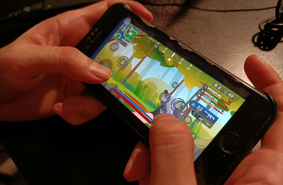
A protype I created in Unity then I import over to my iphone to test
There were no clear references available for me to use as a basis for my design. This meant that I had to spend a considerable amount of time experimenting and iterating to find the best approach. As a result, I had to take a slow and steady approach to my design process. I spent a significant amount of time combining different elements and creating prototypes to test whether they worked as intended. This iterative process allowed me to refine my design and find the best solution.

A diagram I created to explain my HUD concept to the team
05. The results
Overall, the project was a success. By conducting user research, iterating on designs, and collaborating with the team, we were able to improve the game's FTUE, retention, and engagement. We developed a clean, intuitive UI and HUD that was dynamic and expandable, and we made innovative interactions for joining parties, customization, and selecting modes. The HUD was designed to be compact and functional without taking up too much screen space, and we even improved the combat experience through user testing. With these improvements, we are confident that players will have a better overall game experience and we look forward to continuing to iterate and improve the game in the future.
Project takeaways
I absolutely loved working on this game. The team was very responsive, helpful, and super fun to work with, I learned so much from this project. This is one of the rare occurrences where I could work together with such a large multidiscipline team in a professional setting. Through user testing, many of my first assumptions were proven to be wrong and pressed me to change my rather static "at the surface" level throught. I learned to corroborate in an effect manner as time are rather limited. It was such an honor to be a part of such a great game experience.